Unveiling Koofr's Brand New Logo!
To commemorate the start of Koofr's next decade, we've treated our logo to a crisp and modernized redesign. A new look for the trustworthy tool you know and love!
Written by human for humans
If you noticed that there's something a bit different about the look of your favourite cloud storage - well spotted!
Koofr has been with you for 10 years now. It makes us so happy that we can proudly look back at a decade of organic growth and development, constantly improving with each new feature. We've managed to do this while staying profitable and firmly independent - our commitment has always been, first and foremost, to our users.
So, we step into our tens with a brand new image. Earlier this year, we gave our website a facelift with a modern design for the 2020's. And now, we are proud to bring our makeover full circle with a fresh and sleek new logo!

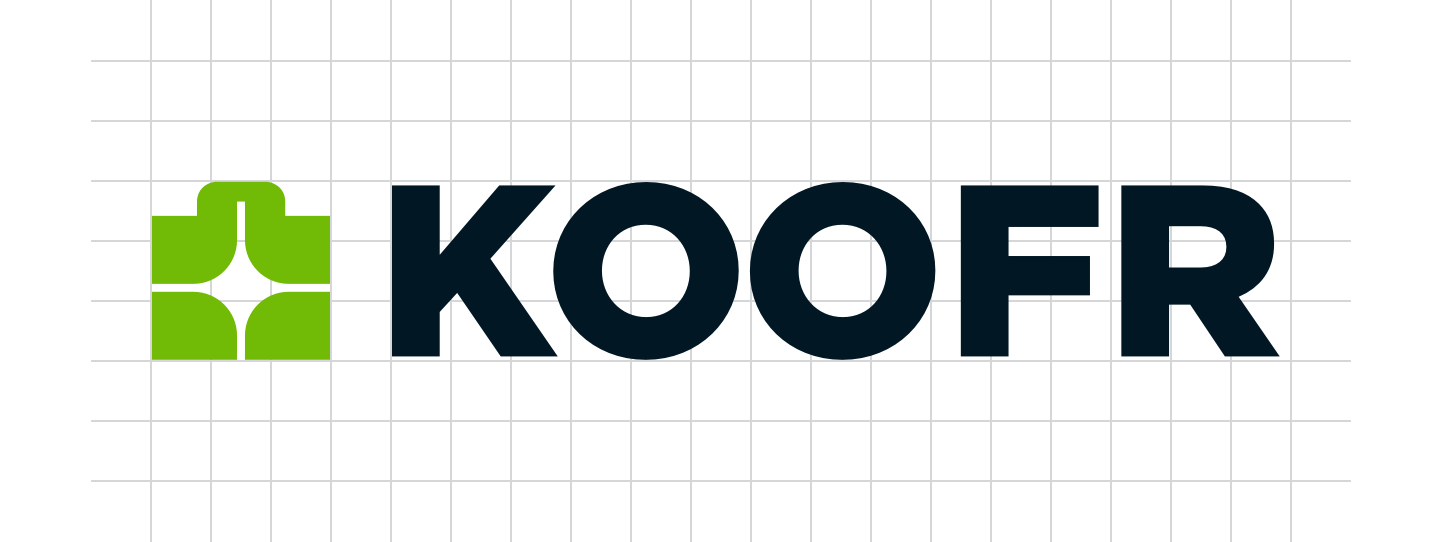
The new Koofr logo takes our old suitcase logo as a starting point. Why choose a suitcase? Well, the name 'Koofr' is made up, but it stems from a family of related words in various European languages: the German word Koffer (suitcase), the French coffre (chest), the English coffer (treasury).
We incorporated all those definitions into the word Koofr to symbolise a safe space for your files that you can take with you wherever you go.

The new logo retains the motif of a suitcase, only larger and with a sharper, more defined silhouette. The star detail (which stands for all your favourite things in one unified space, of course) is also still there, but transformed: it now has four points and is placed in the very center of the icon.
The star also divides the suitcase into four parts, taking inspiration from the Koofr app's tile view. It symbolises the different compartments of your Koofr and the ability for you to share parts of what you store with other people.
Those of you with a keen eye might have noticed that the lettering has also been updated. We've selected Gotham as a basis, tweaked it slightly, and gave it a bold new midnight blue colour. We feel that the final result has an improved balance between the icon and text elements of the logo.

For press, bloggers, vloggers, and other content creators: if you're covering Koofr in an article or video, feel free to access our updated press information page for additional branding resources like hi-res logos and screenshots.
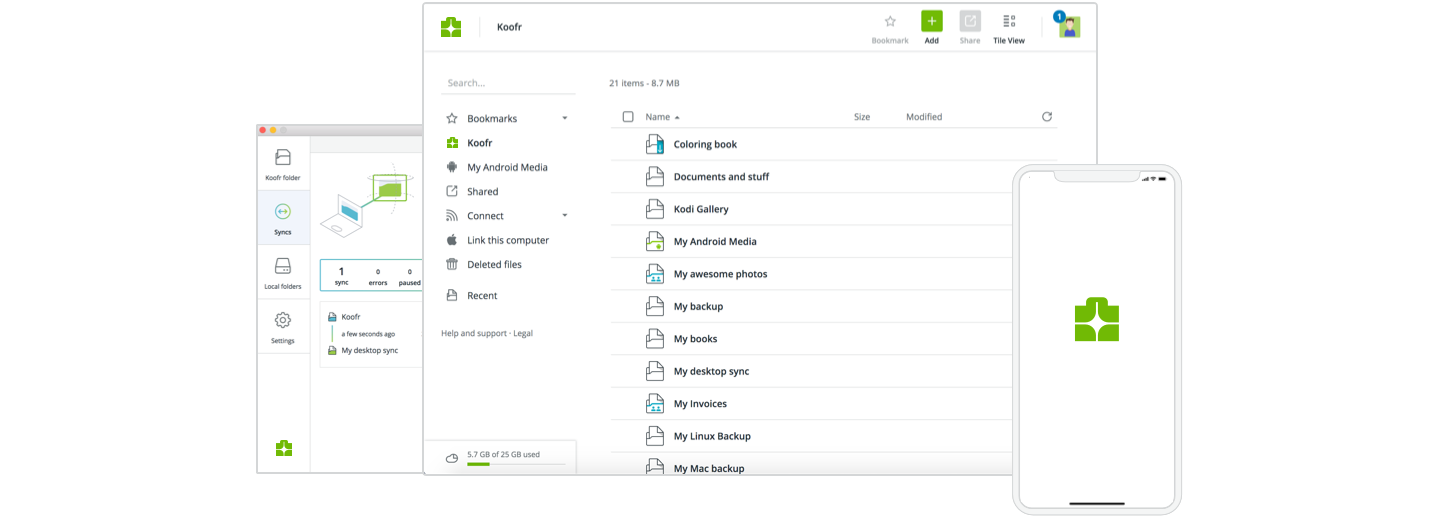
The new logo is being rolled out today to all our apps across devices, but it might still take some time to appear on some systems subject to app review. Also, Android users will be pleased to note that we have added the option to display a themed icon for the Koofr app on your home screen and app list.
What are your thoughts on the new Koofr logo? Join our community on Reddit and let us know what you think!


