How to Create Branding Guidelines and Share them Using Koofr
If you want to ensure a unified and consistent presentation of your brand, you need branding guidelines. Here are a few tips on what to include and how to maintain & distribute the resource using Koofr.
Written by human for humans
Call it what you like - branding guidelines, brand book, brand rules, etc. In any case, we're talking about an essential brand resource that serves to guide and direct stakeholders (like designers, marketing employees, agencies, journalists, and others) when using the brand or communicating it.
Think of it as your brand's bible, a set of documents and visuals that ensure consistent messaging and user experience on all brand touchpoints. Or, to put it plainly, to ensure that all your advertising, packaging, press clippings, social media, merchandising, etc. look like they fit together and match.
Depending on the size of your brand, different people and teams, either internal or external (or both), may be involved in the production of your marketing materials. Having a central resource they can tap into helps everyone stay on the same page.

What to include in your branding guidelines
When putting together a guide on how to correctly present your brand, you need to think of all the different ways people will come into contact with it. Are we talking about a physical product (that perhaps requires packaging) or digital software? Are there visuals beyond the simple logo (like icons, colours, video jingles) required to convey the message?
You might also add a short description of brand DNA that could include important brand values, vision, and history. It's not necessary by any means, but in some cases, this data can inform creative decisions that fall outside the scope of what's strictly prescribed by the guidelines.
These are things your branding agency will take into account when developing your brand, and they also define the materials that need to be created.
Branding elements
Here's a list of elements to consider when putting together your brand resources:
- Logo This is pretty straightforward - one of the cornerstones of your brand is your logo. Generally speaking, you should include the full variety of available options (full logo, icon, simplified, dark, light, color, etc.) for your logo in separate image files. This makes it easier for people to select an appropriate file for what they need.

-
Colours Many brands have a set pallette of colours that are used in marketing materials and designs. It helps to have a chart with colours and corresponding hexes, so that people designing new content don't have to go by eye.
-
Voice and language Often, brands have a specific tone of voice they use in written content such as blogs, ads, social media, and other copy. You can use adjectives to describe the brand voice: for example "playful and whimsical" or "warm, but firm". In some cases, you might want to explicitly list vocabulary that may or should be used - or avoided.
-
Typography Often, brands rely on a selection of fonts and font styles to convey a unified look and feel across media. This is especially true in the era of modern Internet, in which company and product websites are intricately designed and overflowing with content in various forms. Having a style guide for typography ensures that all text is always on brand - at least visually.
- Packaging If applicable, you may want to include some information and guidelines for the packaging design, eg. listing the materials, folding instructions/schematics, or merchandising instructions.

-
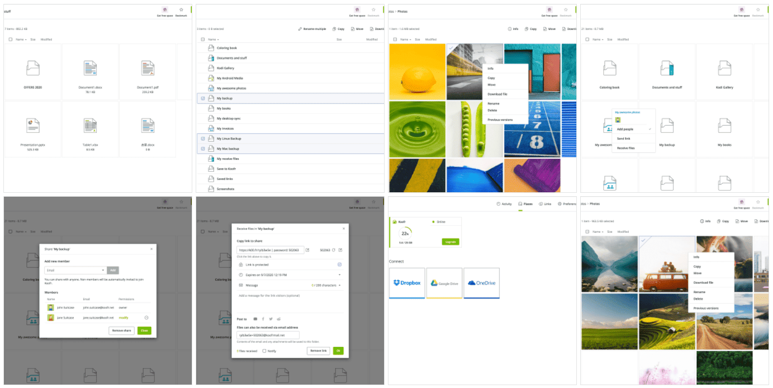
Product screenshots For software products, it makes sense to prepare an album of screenshots to showcase the program's features and interface. Not having to take their own screenshots will help creatives save time.
-
Product photography Similarly, if you have a physical product (or a range of them), consider adding some professional product photos to the brand materials. This is especially helpful for PR and external users, and you'll ensure your products look their best wherever they appear.
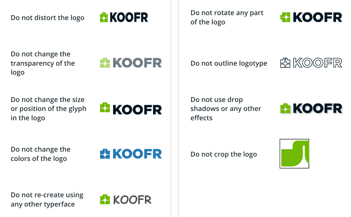
- Dos & Don'ts A good idea is to include a list of dos and don'ts, particularly when it comes to logo use and placement. These tips coupled with a variety of available ready-to-use logo files will ensure that your logo always looks good.

It's absolutely fine if you don't want to include all of these in your branding materials. Some of the suggestions might not even apply to your brand, so just use the elements that are relevant and important for you.
You can also create different versions of branding guidelines for internal and external use.
Hosting branding documents on Koofr
Koofr is a great solution for hosting branding guidelines and other brand resources. You can easily add, remove, or update files stored in a dedicated folder yourself, so it can be managed without involving your web team every time a change needs to be published.

You can organize the contents of the folder by context or use, eg. create a folder specifically for product screenshots or photography.
The folder can then be shared by adding users (for internal use) or by creating a link (for internal or external use). More on Koofr's sharing options.
Links can be customized by setting a custom URL and adding a custom introductory message. If you need to restrict access, you can protect the link by adding a password.
Example: Koofr branding
You know us - we would never preach something we don't practice. We use Koofr to host Koofr's own branding resources. Our Press information page contains basic information about Koofr.
As you can see, we've included a number of variations of the Koofr logo, a collection of screenshots of the Koofr app family, and a guide for logo placement. Feel free to have a look!
Want to talk to us? Join us on the Koofr subreddit!


